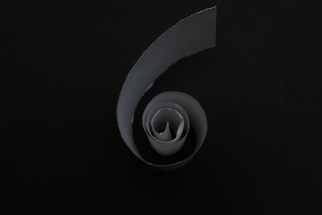
Ion Zupcu
|
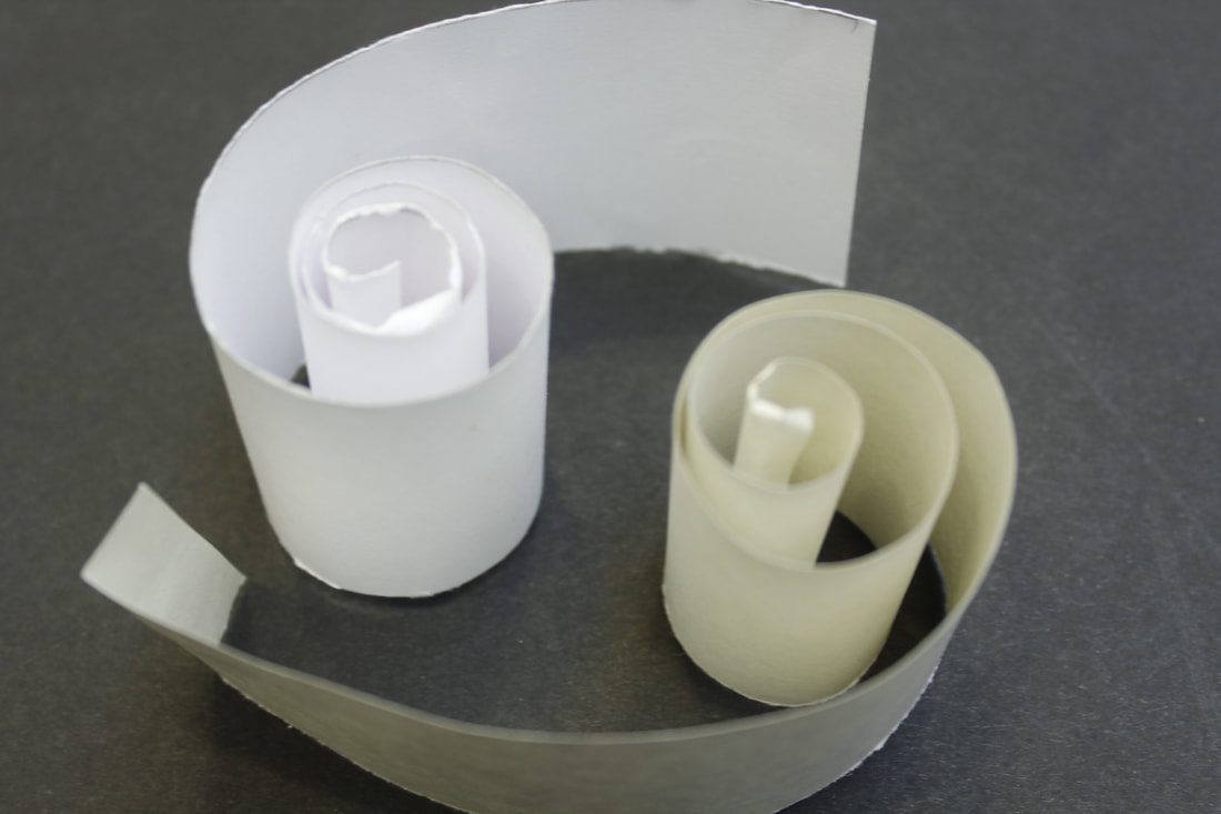
Ion Zupcu is a Romania-born, New York based fine art photographer who elegantly redefines space with paper sheets in his series ''Works on Paper" created between 2004 and 2006. Alongside photographs of his own paintings of cubes, Zupcu shows delicate double exposures of patterns, in which the play of solid and ephemeral geometries parallels his deft manipulation of the infinite shadings between black and white.
|
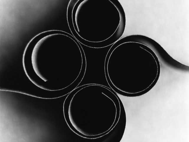
I like Ion Zupcu's work because his images are so simple yet sophisticated. He manages to turn scraps of paper into pieces of art. I also like the way he turns all of his pieces to monochrome as it gives the image a grim lonely vibe even though it's just paper.
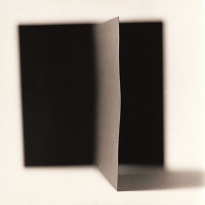
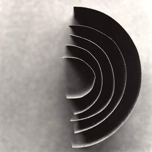
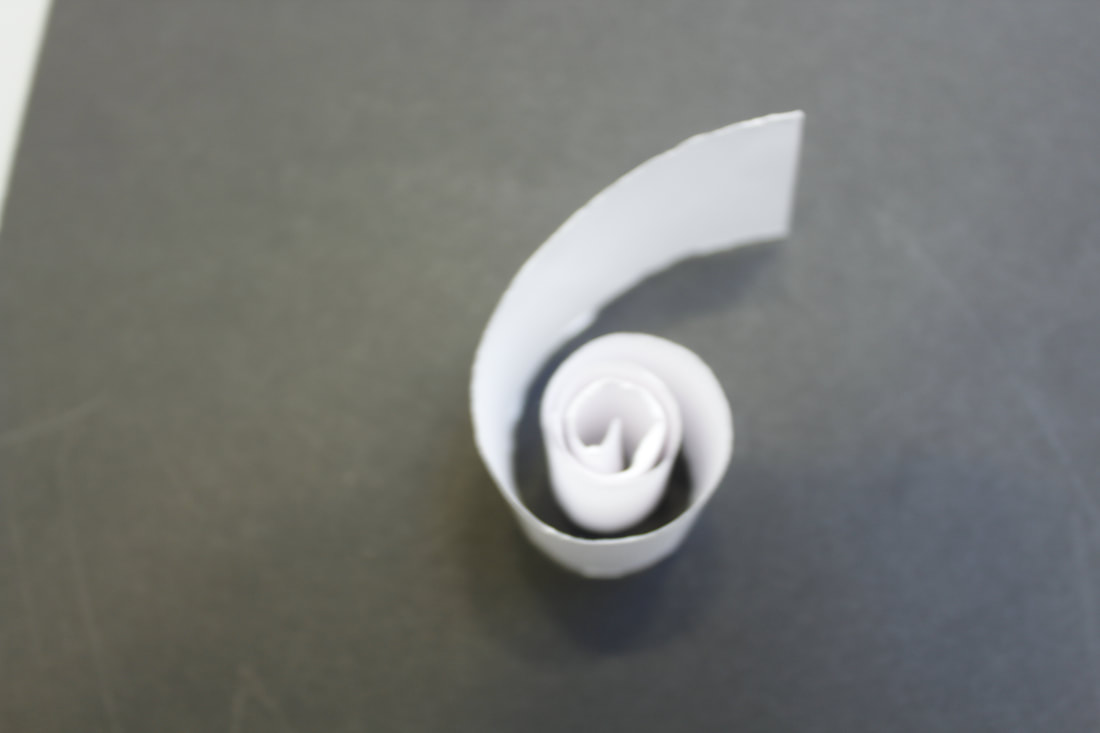
-MY LEAST FAVOURITE IMAGE-
|
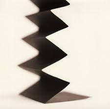
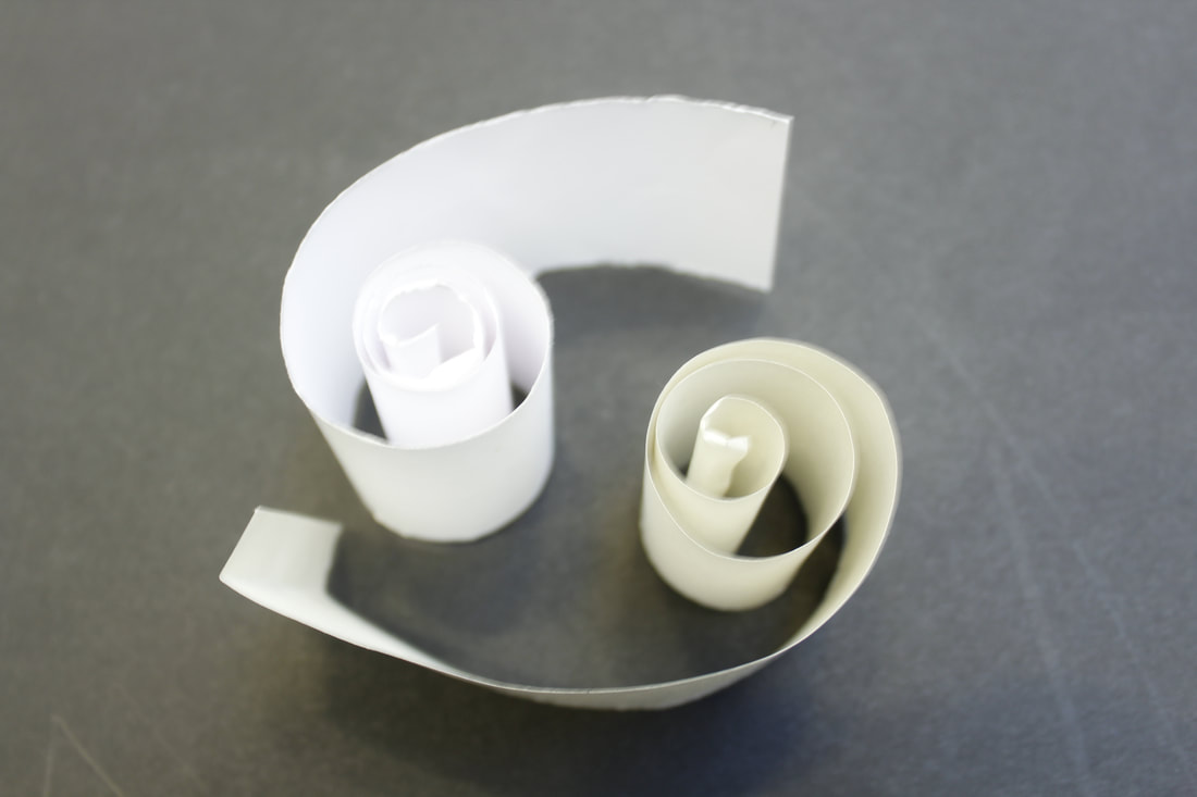
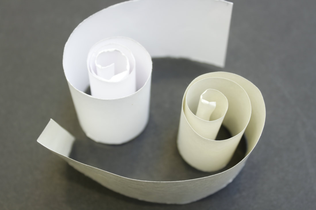
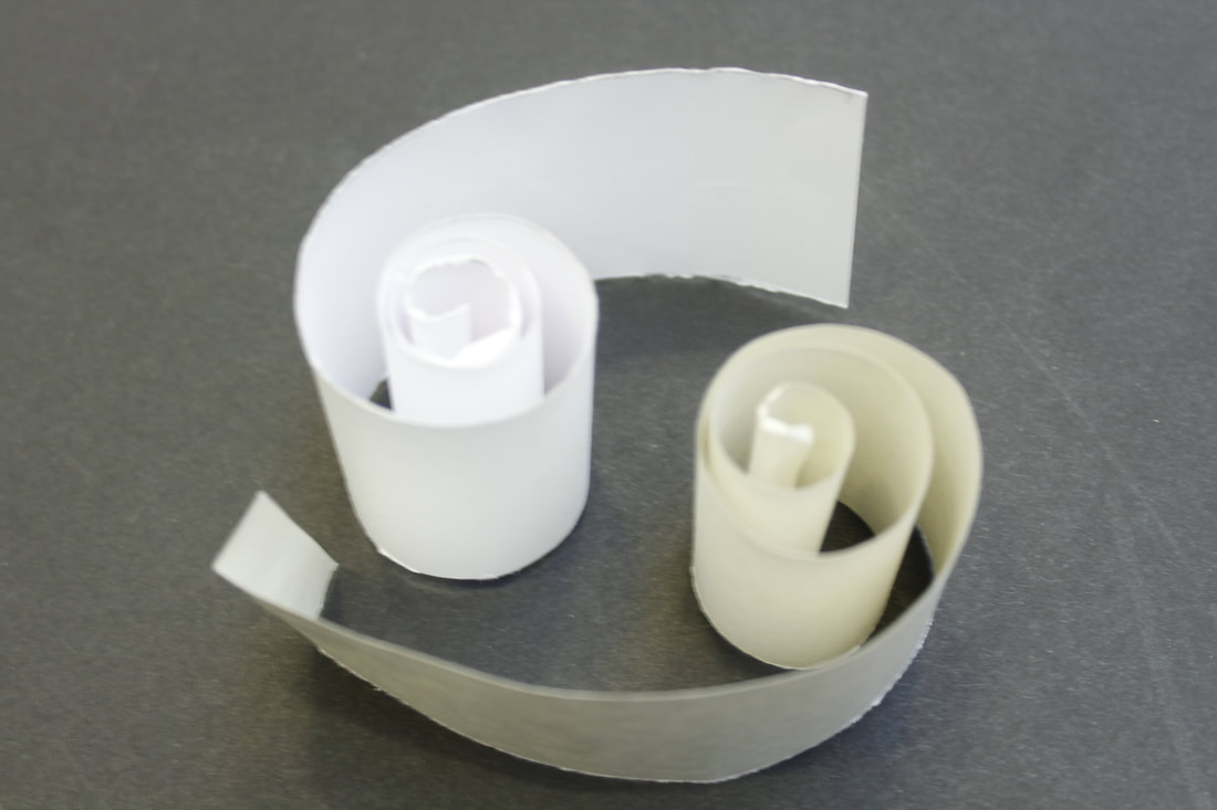
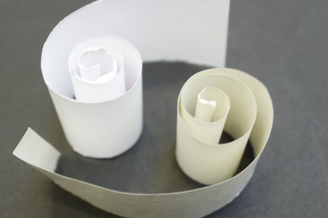
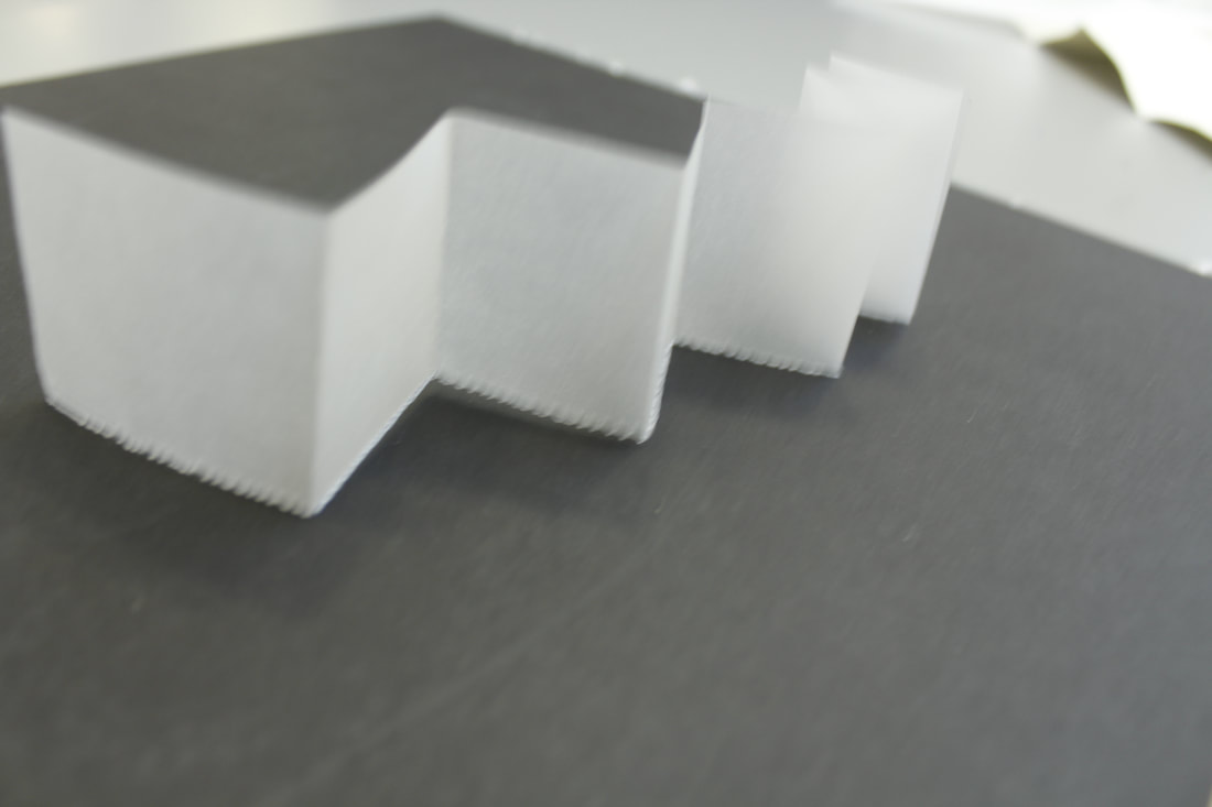
This is my least favourite image because even though the simplicity is effective and the monochrome contrasts the two colours, Zupcu hasn't used the Rule of Thirds and he's just captured it right in the middle of the image and personally, in my opinion, I think that having the main object of the image in the centre just makes the image seem a bit boring and not at a great quality. However, he has captured the shadows and he has changed the focus point giving the side of the paper a sharper edge which I do find quite effective.
|
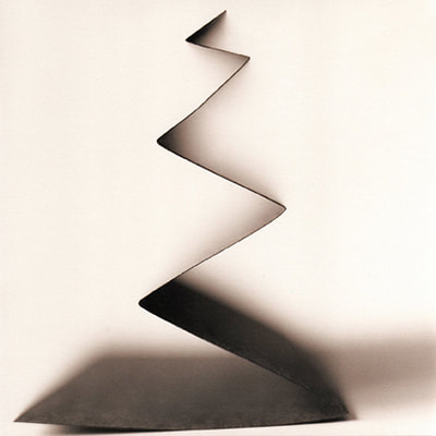
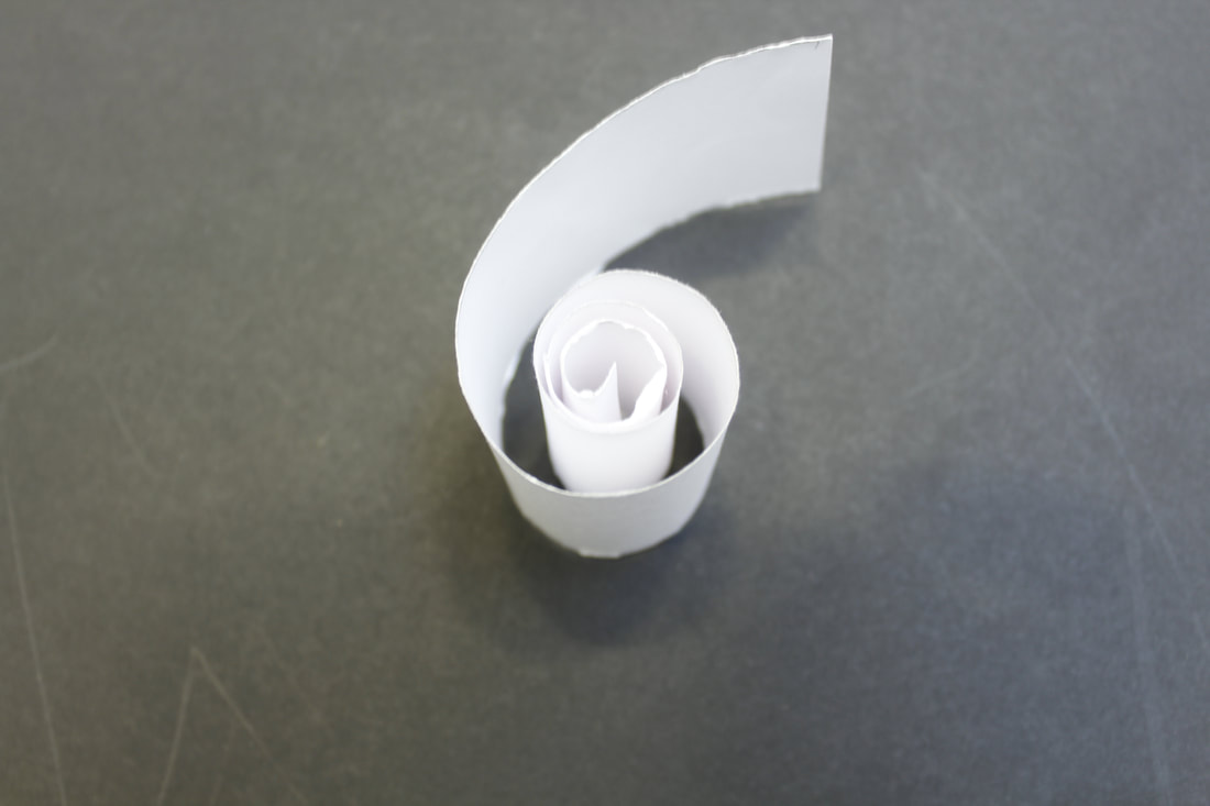
-MY FAVOURITE IMAGE-
|
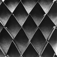
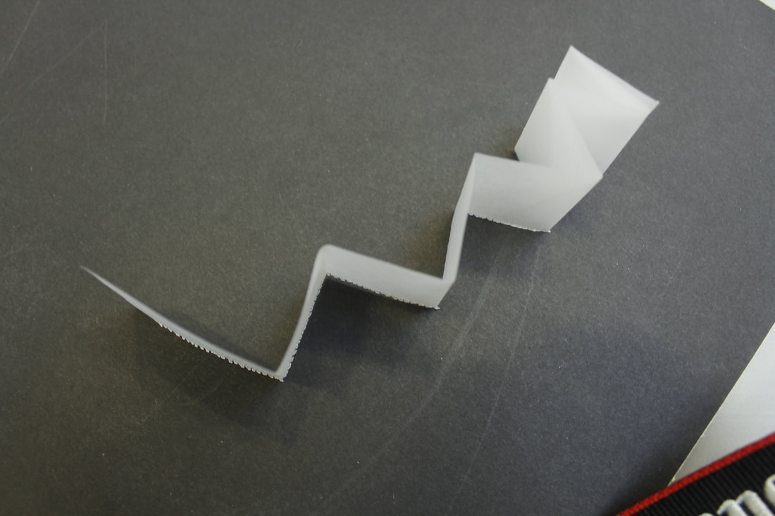
This is my favourite image out of Zupcu's works for a few reasons. Like many of his other works, I love the simplicity of it. He has also successfully changed the focus point and used the Rule of Thirds. I like this because it puts more focus on the main object, the use of the black and white make the colours contrast really well. and the focus point makes the shadows blend effectively. Finally, I love the message that this image portrays. The rainbow shape that has been created with the paper/card contrasts really well with the monochrome as rainbows are all bright and colourful and the image is dark and sad. To me this signifies that there is a deeper message in this piece of art.
|
|
Abigail Reynolds
|
British artist Abigail Reynolds does not take images at face value. Using the art of collage, she enhances the original picture by creating intricate assemblages out of re-purposed vintage photographs, magazines, encyclopedias, atlases, and other materials she finds.
Abigail Reynolds lives in St Just, Cornwall, and has a studio at Porthmeor in St Ives. She studied English Literature at St Catherine's College Oxford University. Her interest in books & libraries prompts her collages and sculpture which are often composed of found photographs spliced to create fresh narratives. |
|
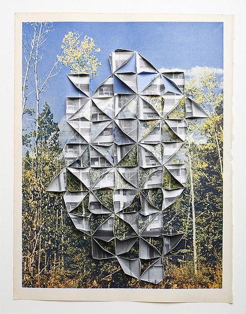
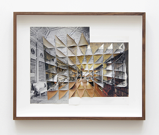
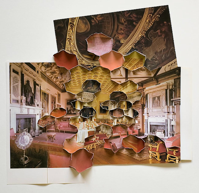
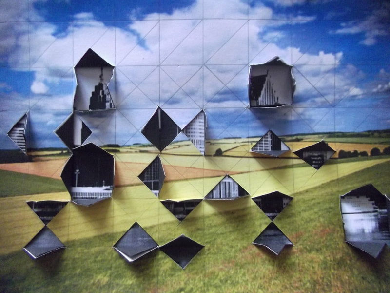
Compared to Zupcu and Tolino, Reynold's work is more complex and is more detailed. Personally, Abigail Reynolds is my favourite paper photographer as her works show deeper meanings and hidden secrets in life. And I love how, when she overlaps her images, some of it is completely monochrome and then the other is so bright and colourful.
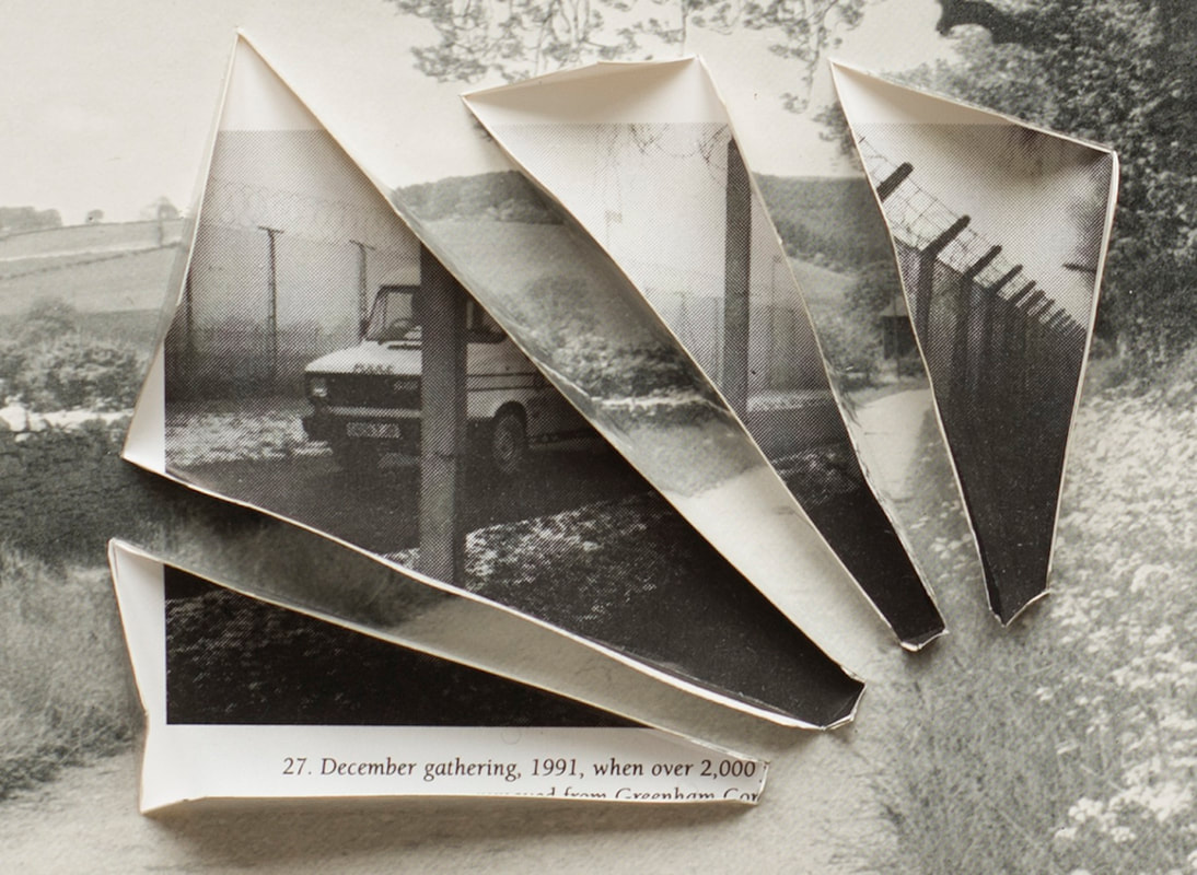
-MY LEAST FAVOURITE IMAGE-
|
This is my least favourite image as there is nothing significant or special about it. Its a pretty boring image and there's just not much to say about it.
|
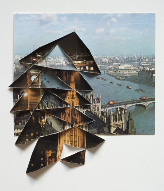
-MY FAVOURITE IMAGE-
|
This image however, there is a lot to like about it. The overlayed image is great as there's a wide range of view and the colour has been faded a bit to make the image look more authentic and then the image behind it is all monochrome making the two contrast.
There is another way the two images contrast this is shown in the hidden meanings within the image it shows a gorgeous field somewhere out in the country side and then, hidden behind it, there is a city skyline to show how people destroy nice things like nature and natural earth. I also like the fact that the image is 3D. |
|
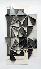
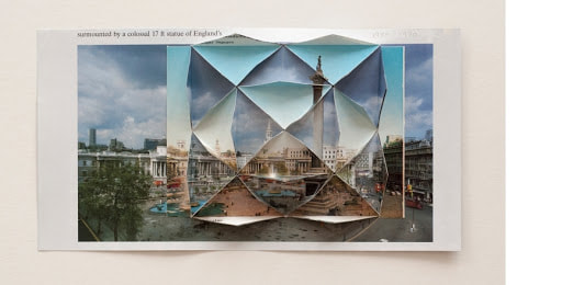
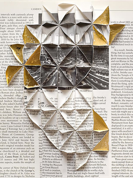
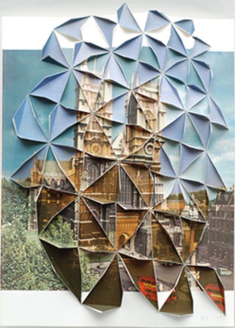
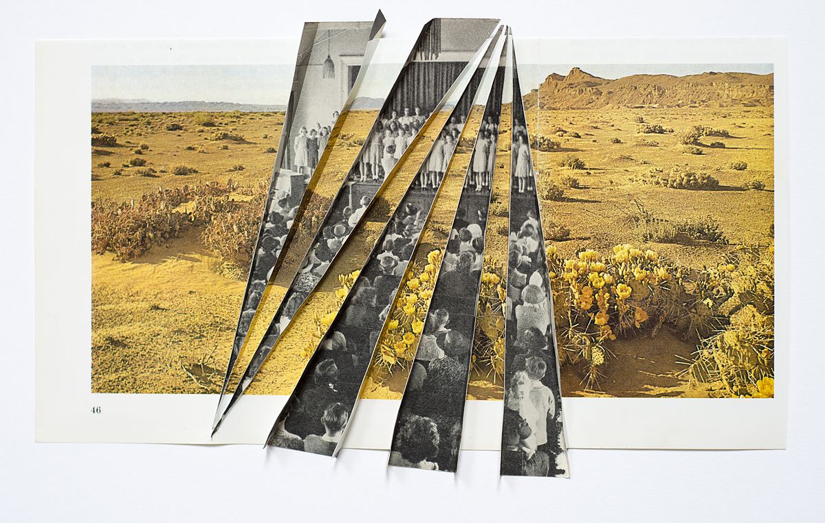
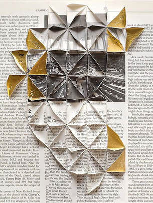
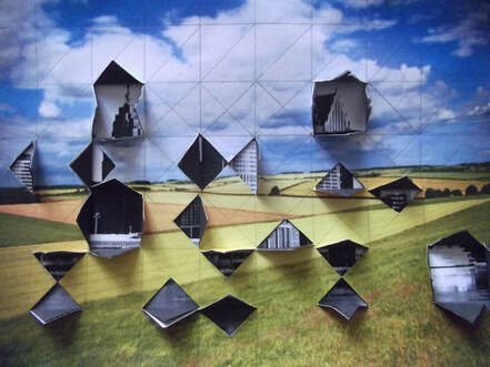
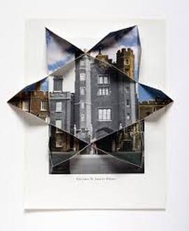
Aldo Tolino
|
Aldo Tolino is an Austrian media-philosopher and media-artist which creates sculptural objects out of printed photographs or distorted portraits made through the use of digital art. He creates geometric mutations of human portraits. The distortions generate new facial representations, expressions, and personalities, translating the original picture into a manipulated deformity.
|
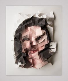
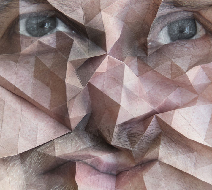
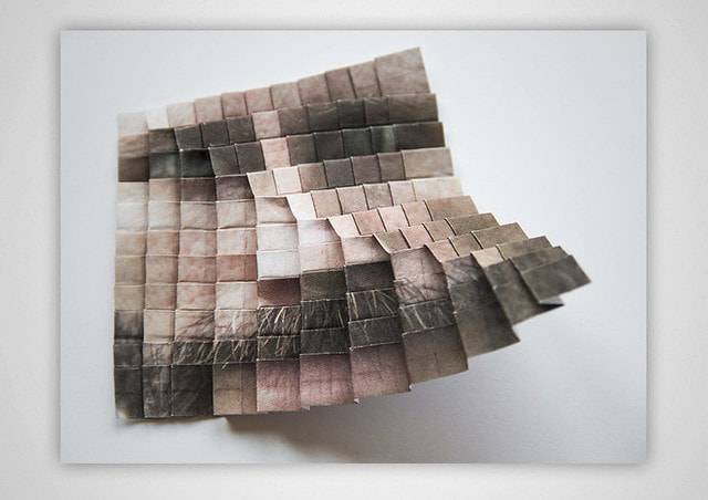

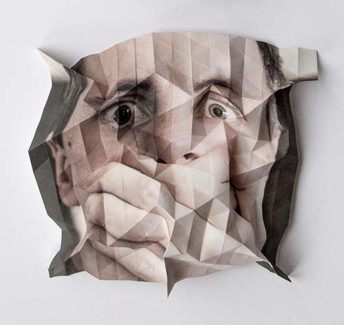
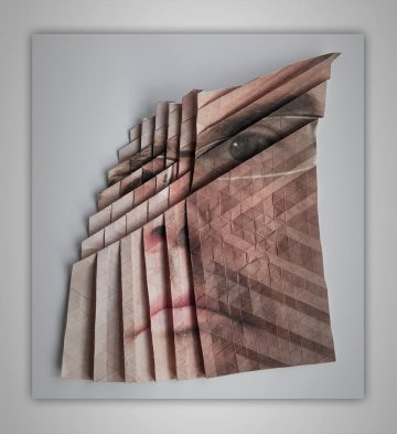
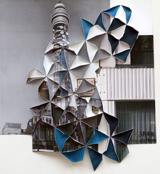
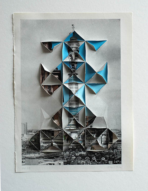
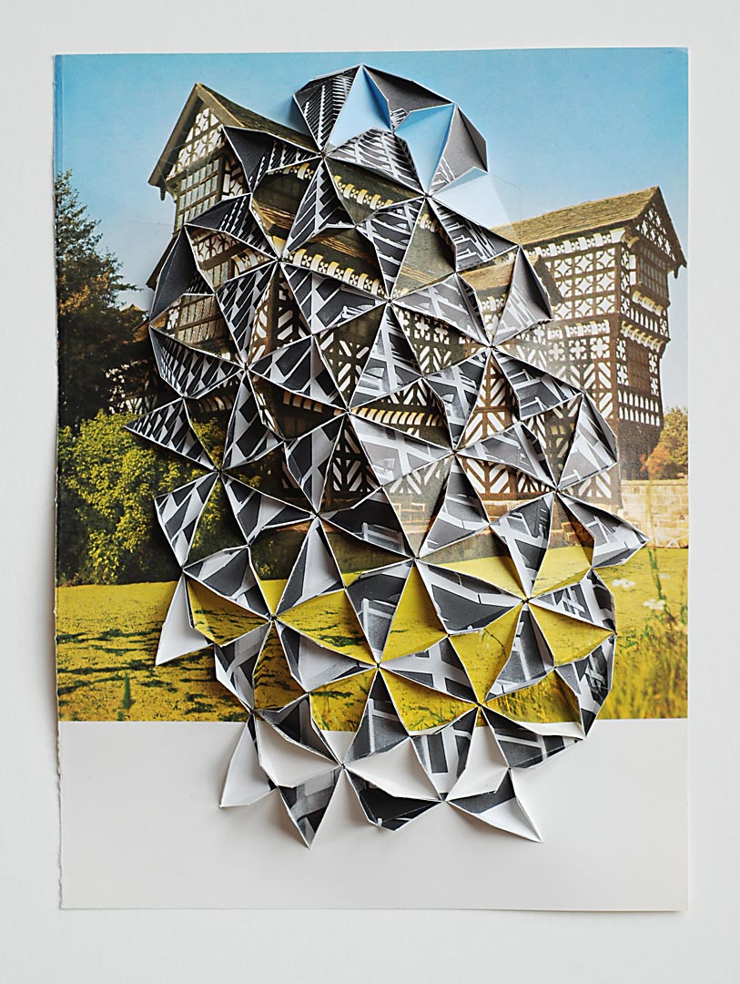
I chose to analyse Tolino's work because I like how he's used a mixture of portrait and Landscape images and turned them into something more. Hes used origami and folded the images to give them a different texture so theyre not just plain flat images.
-MY LEAST FAVOURITE IMAGE-

|
The image on the left is my least favourite image because I don't like the way the paper has been folded as it makes the portrait look deformed and distorted. However Tolino has effectively captured all the shadows in the creases of the paper and the higher exposure has made the image look more elegant and professional.
|
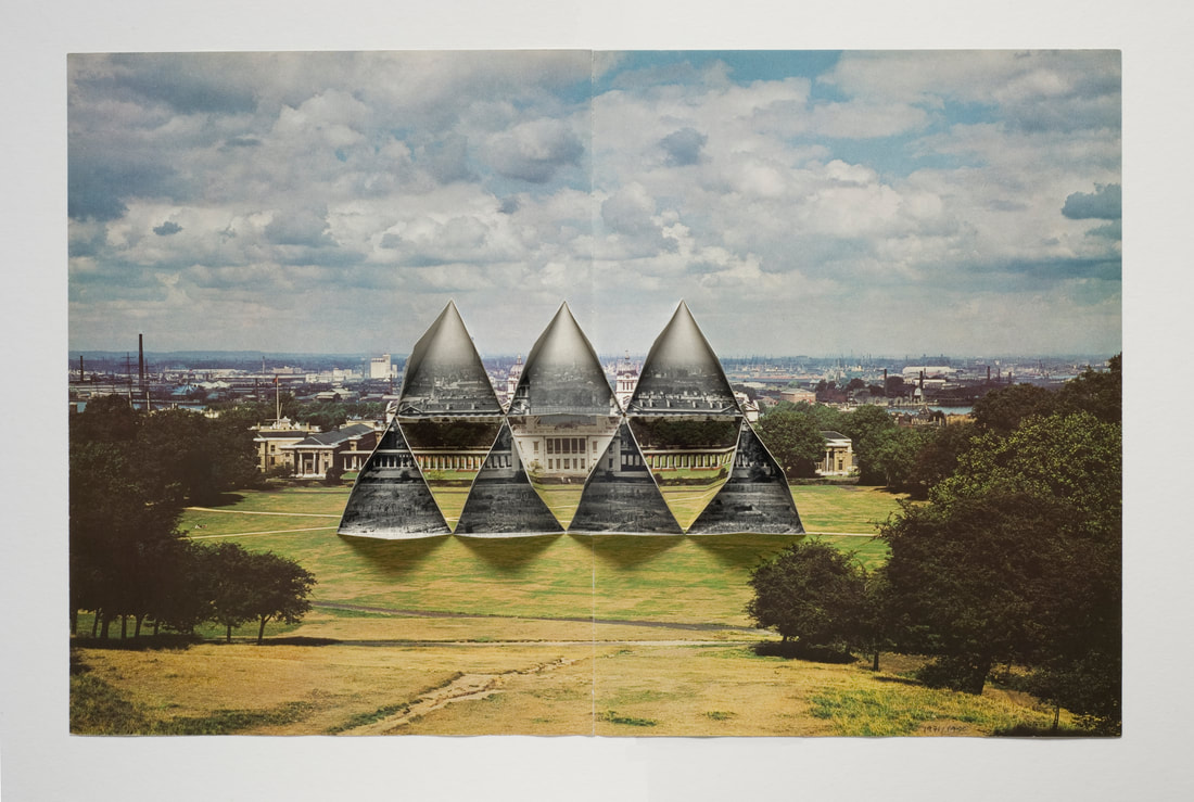
-MY FAVOURITE IMAGE-
|
Out of all of Tolino's works the image on the right is my favourite, this is because he's turned the image into origami perfectly aligning the two images. Another thing I really like about this image is the use of the normal image and the same image but monochrome and the fact that its a historic building makes the use of monochrome more significant as the building looks old and the black and white image looks washed out and old.
|
|
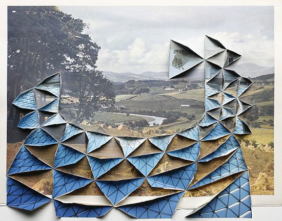
-SHOOT 1-
|
-PLAN-
|
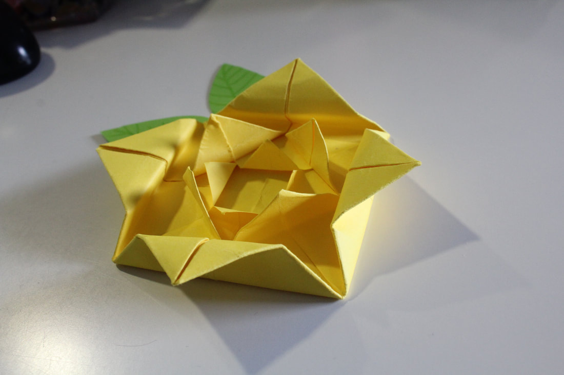
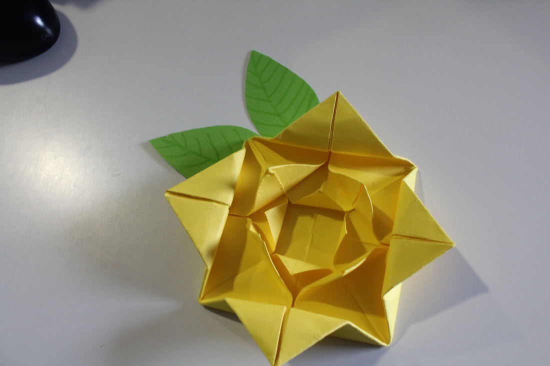
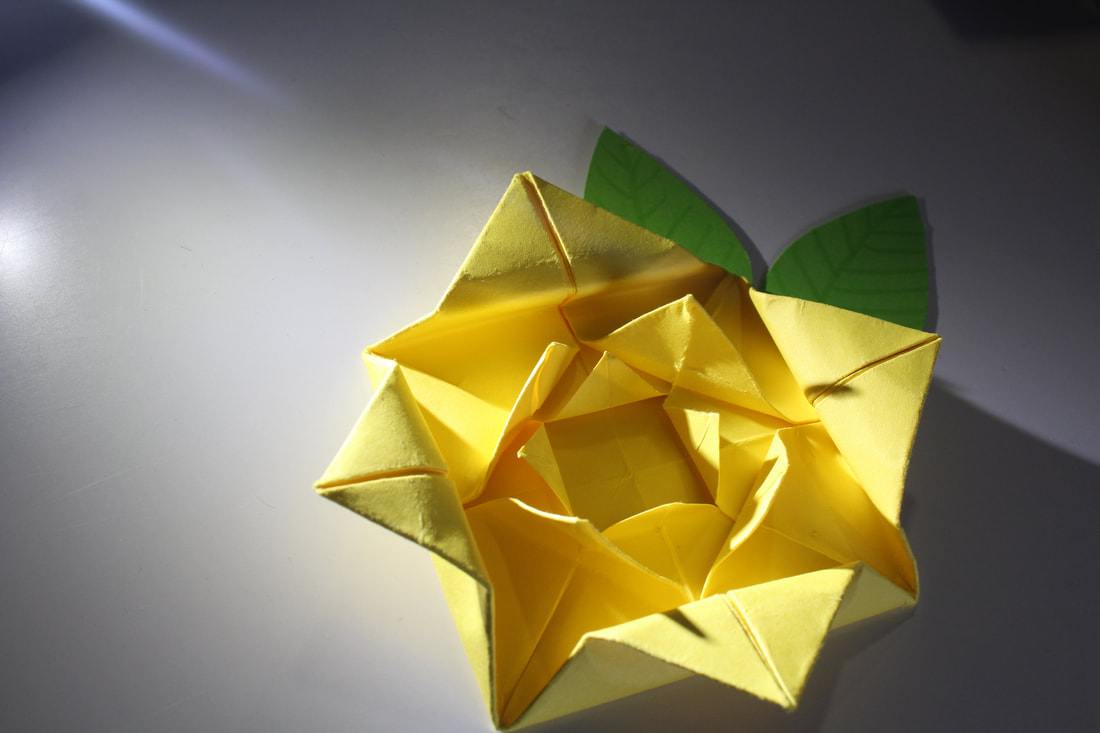
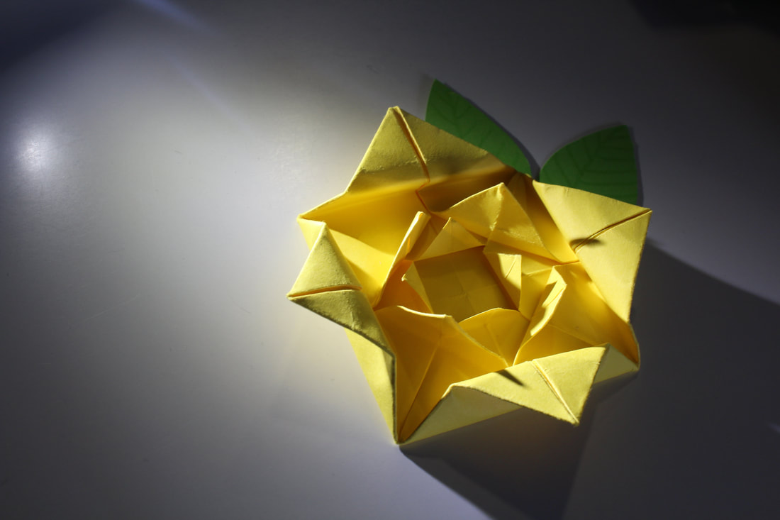
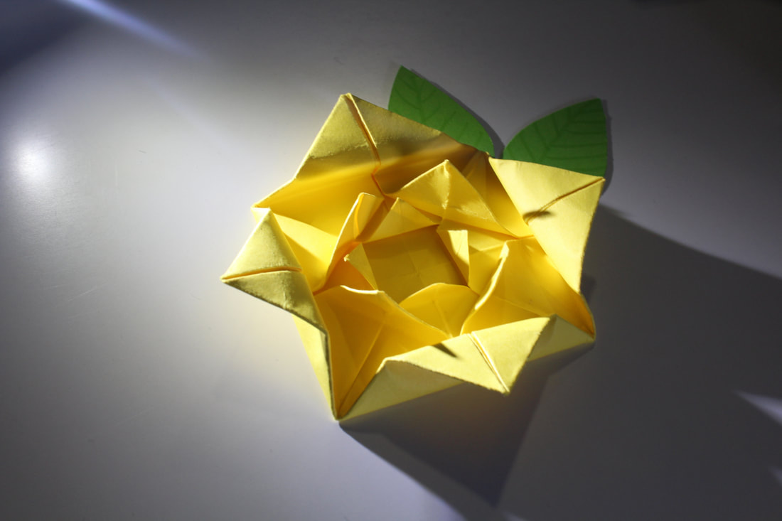
-SHOOT 3-

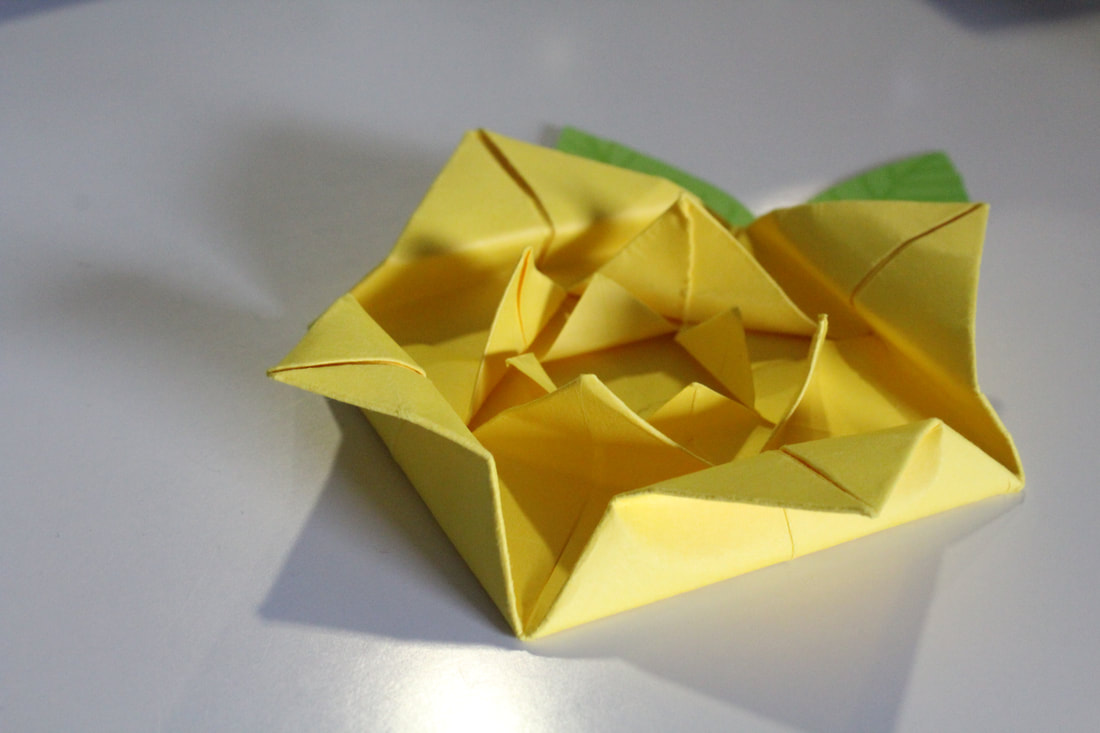
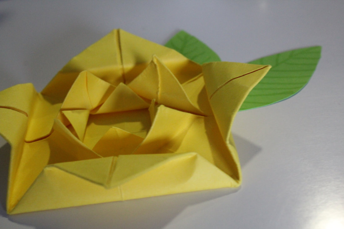
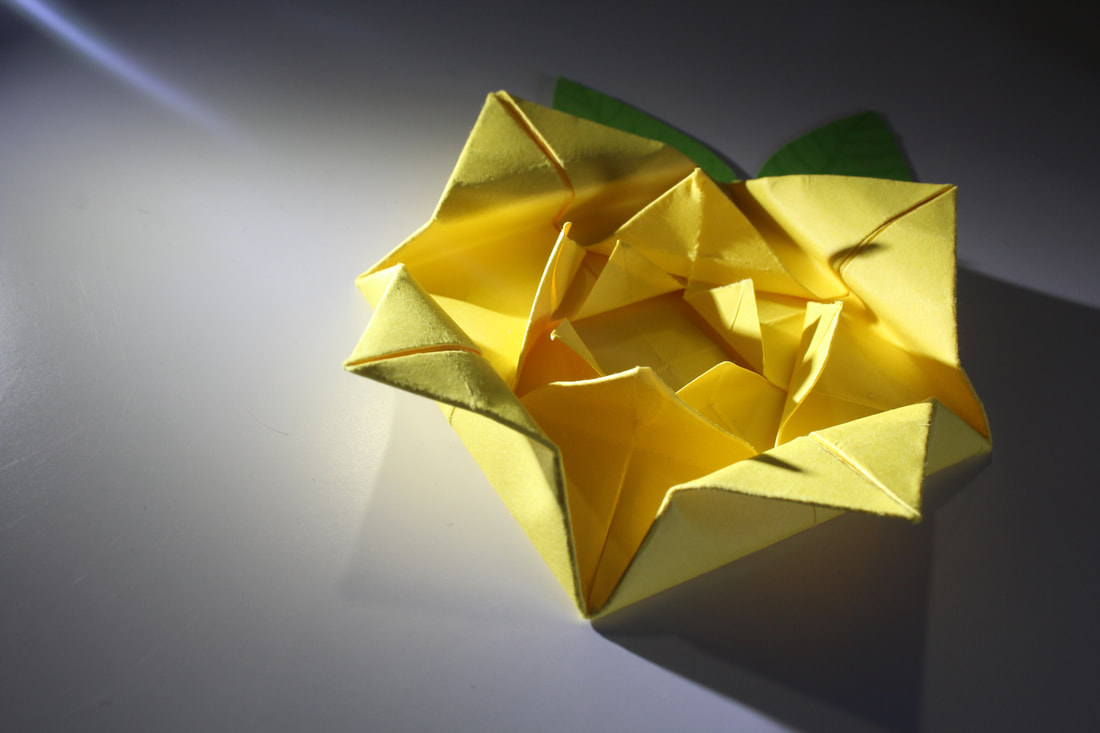
-WORST IMAGE-
I don't like this image because it doesn't have great lighting and it
-BEST IMAGE-